

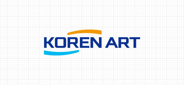
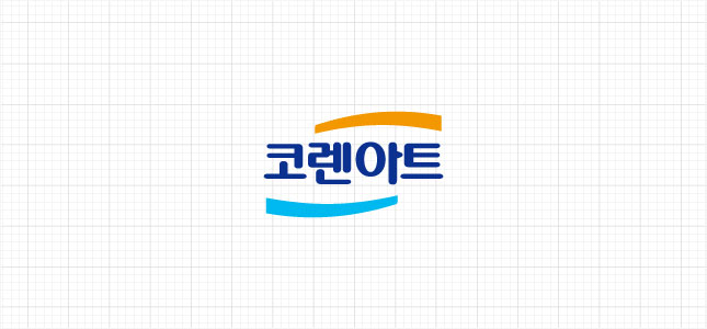
WORDMARK
As a symbol element representing Koren Art, it is the most essential element representing the corporate image. For a consistent image, the attached original data must be used when using it.
-
English type
-
Korean type
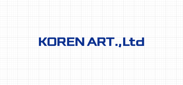
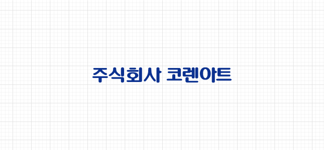
LOGOTYPE
The logo type was created in consideration of harmony with the symbol, so it should not be arbitrarily modified and used. When using, you must use the included data file.
-
English type
-
Korean type
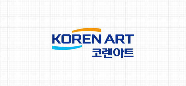
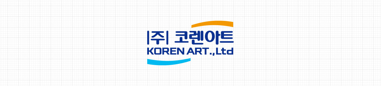
SIGNATURE
A signature refers to a combination of a symbol and a logotype according to a certain rule. It can be used inappropriately for each application environment and readability. The proportion, weight, and size of each element cannot be arbitrarily changed, and the included data file must be used when using it.
basic
-
vertical
-
horizontal
conjugation
-
vertical
EXTENSION BRAND
The extended brand is a regulation established to expand the brand of Koren Art into various product areas. When using other than the prescribed color and library, it can be used in various ways after consulting with the relevant department. , should be reduced to use.

MAIN COLOR
Exclusive colors are colors chosen to effectively convey the corporate image. Expression can use both 4 primary colors and spot colors depending on the characteristics of the applied medium. When printing, the PANTONE colors below must be observed, and even in non-print applications, close attention must be paid to maintaining the optimum condition closest to the specified color yarn.
Main Color
Sub Color
-
PANTONE 306C
CMYK
70 / 0 / 0 /
RGB
0 / 185 / 239
-
PANTONE 306C
CMYK
70 / 0 / 0 /
RGB
0 / 185 / 239
-
PANTONE 306C
CMYK
70 / 0 / 0 /
RGB
0 / 185 / 239
-
PANTONE 306C
CMYK
70 / 0 / 0 /
RGB
0 / 185 / 239

COPYRIGHT 2021 KOREN ART. ALL RIGHTS RESERVED
- 070-4610-3121
149, Oenam-ro, Cheongwon-gu, Cheongju-si, Chungcheongbuk-do. KORENART Co., Ltd